Brand Identity
Illustration
Print Design
Digital Design
Brand Identity
Illustration
Print Design
Digital Design
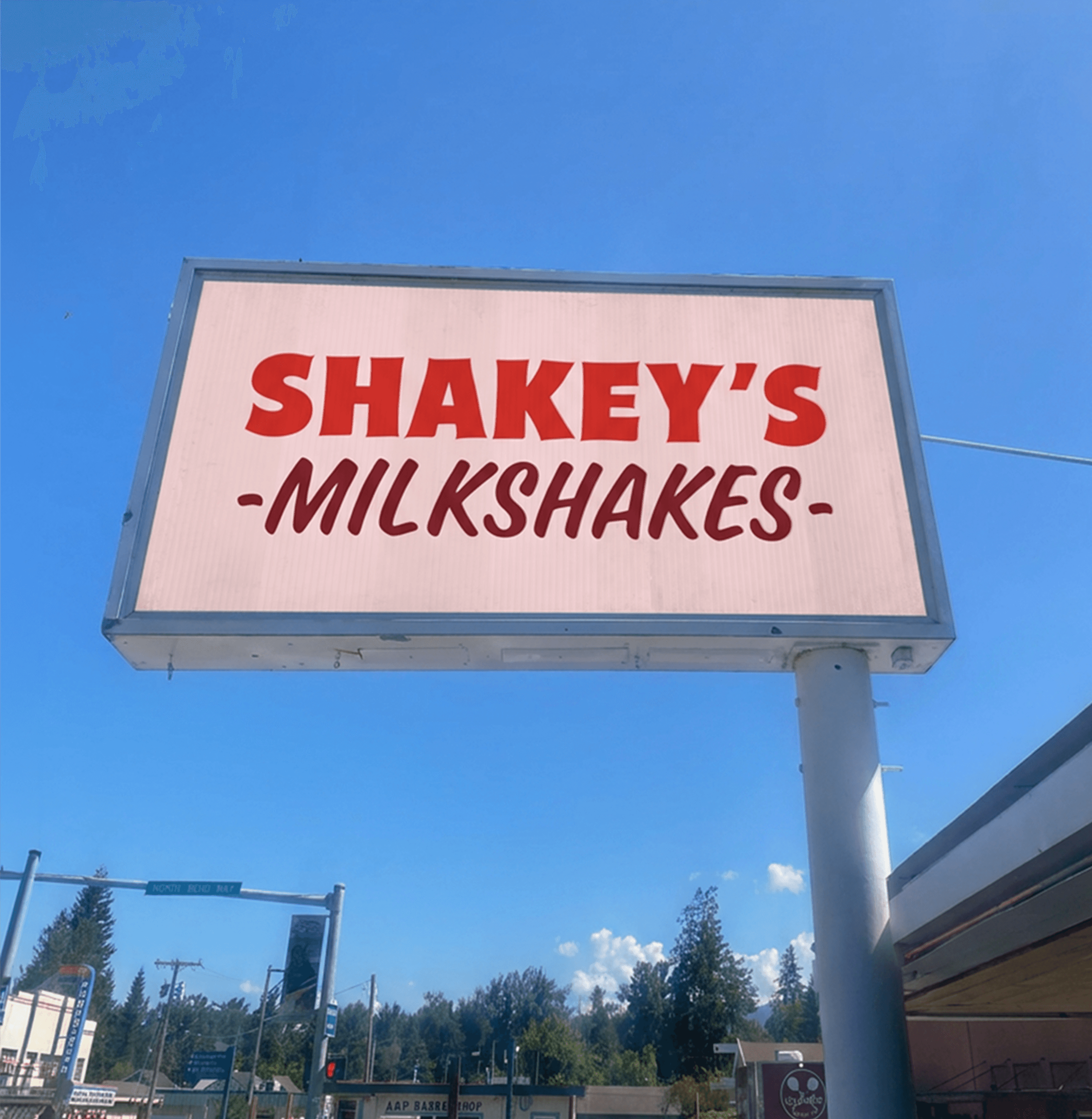
Shakey's is a self-initiated branding concept that reimagines the nostalgia of 1950s Americana for a modern audience. The project explores how classic diner culture can be translated into a visual identity that feels bold, familiar and full of personality. I wanted to capture the character of vintage diner signage, typography and iconography while giving it a fresh, contemporary feel. The result is a playful identity that feels nostalgic without looking dated.
The colour palette takes inspiration from classic diner favourites. Vibrant red references cherries, cherry pie and ketchup, creating an immediate connection to the concept. A softer pink brings a more contemporary feel, while deep burgundy and white provide balance and contrast.
The typography draws on the bold lettering of vintage diner signs, reinterpreted for a contemporary identity. Chunky display type gives the brand impact and personality, while the supporting typeface keeps it approachable and easy to read across print and digital applications.
Shakey's is a self-initiated branding concept that reimagines the nostalgia of 1950s Americana for a modern audience. The project explores how classic diner culture can be translated into a visual identity that feels bold, familiar and full of personality. I wanted to capture the character of vintage diner signage, typography and iconography while giving it a fresh, contemporary feel. The result is a playful identity that feels nostalgic without looking dated.
The colour palette takes inspiration from classic diner favourites. Vibrant red references cherries, cherry pie and ketchup, creating an immediate connection to the concept. A softer pink brings a more contemporary feel, while deep burgundy and white provide balance and contrast.
The typography draws on the bold lettering of vintage diner signs, reinterpreted for a contemporary identity. Chunky display type gives the brand impact and personality, while the supporting typeface keeps it approachable and easy to read across print and digital applications.


Dràm Mòr Group
Brand Identity
Digital & Print Design
Digital Design
E-commerce