
Research
Through competitor analysis and user testing of existing travel apps, I identified opportunities to improve the travel booking experience. Research revealed that users often struggled with information overload, relied heavily on saving destinations for future planning, and sought more efficient ways to discover high-quality travel experiences. These findings directly informed the design of a clean, intuitive interface that prioritises inspiration, discovery, and ease of use.
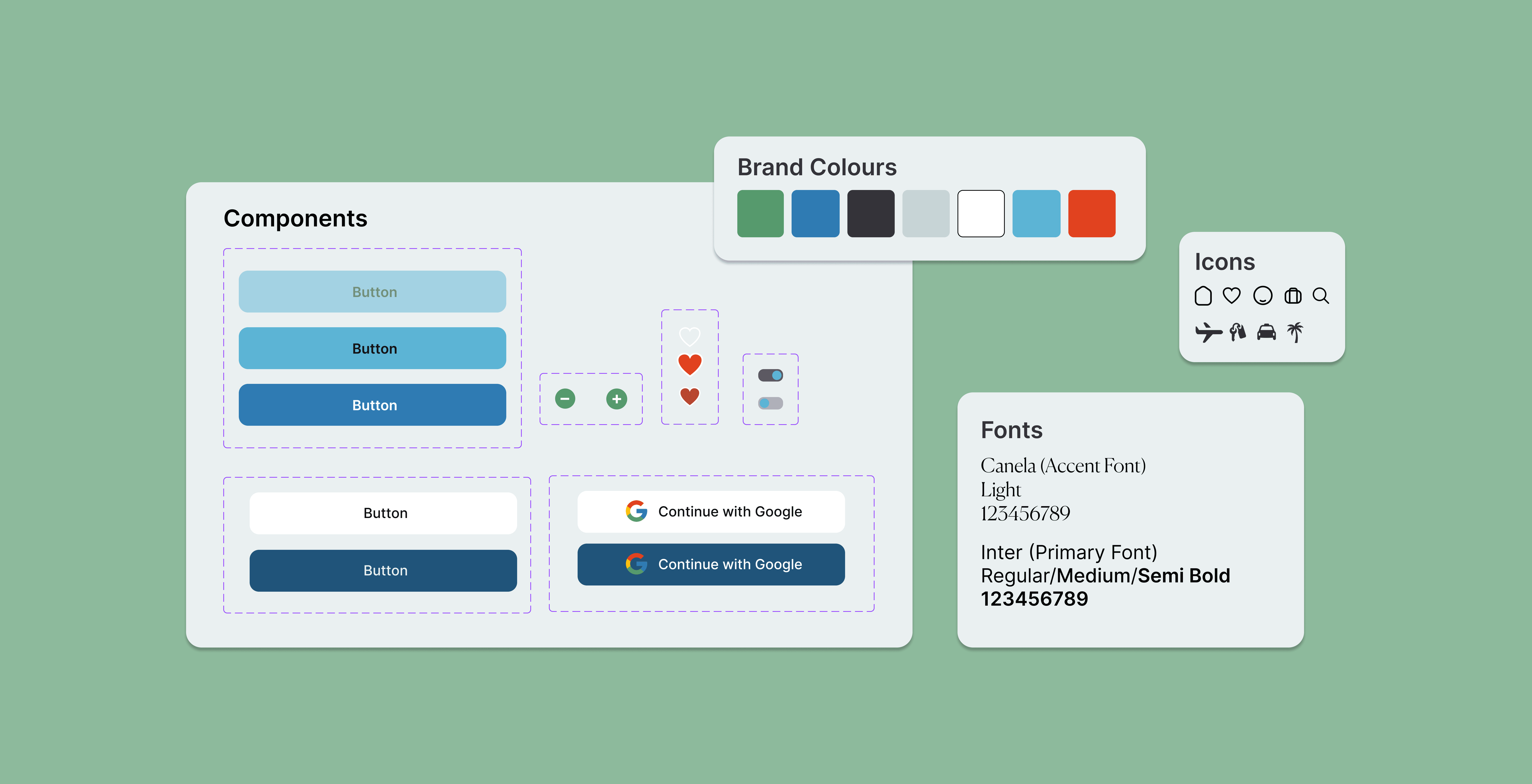
UI
The UI was designed around a destination-first experience, using aspirational imagery, calming colour palettes, to create a premium yet approachable travel platform. Consistent visual hierarchy, progressive disclosure ensure that users can discover, save, and book trips with minimal cognitive effort.

Design
Islander was designed to create an immersive, inspiration-led experience by focusing attention on destination imagery with minimal distractions. The clean layout and generous spacing establish a premium feel while allowing users to engage emotionally with the content.
A key focus was reducing cognitive load through progressive disclosure, introducing information gradually rather than overwhelming users with choices. Strong visual hierarchy, subtle styling, and consistent design elements help maintain a seamless and intuitive journey from discovery to booking.
View next project

Branding and Motion

Branding & UI
